Artist Statement for Hack #3

For this hack, we were tasked with taking a form of software that we are already familiar with and repurposing it from its original design and making it have some type of a different use than it did before. We had to think outside of the box and find a way to make the software that we selected to make it do something it is not technically supposed to be able to do. This idea of repurposing is really interesting as Anthony Dunne and Fiona Raby have an interesting way of mapping this process out in Speculate Everything: Design Fiction and Social Dreaming (2013). They claim that when thinking about speculative design, you can look at it as A/B. The “A” side of this process is a more set path with one single defined use. As the “B” path is where you are more open to speculation and ideas and try to look into different versions (Dunne and Raby, 2013). To be more specific about the relationship between “A” and “B” in this speculative design process they state, “B was not intended to replace A but to simply add another dimension, something to compare it to and facilitate discussion” (Dunne and Raby, 2013). For this project, we essentially have to take a software, that is the A, and to add on to it and create some new way for it be used by users, that is the B. At first I was really struggling with trying to come up with an idea for this project as I do not interact with many other forms of software besides the most basic ones needed for school. The extent of my daily software usage consists of Google software for school, Microsoft Word, Excel, Discord, iMessage, social media, and Moodle. Because of this, I wanted to use the one that I was most familiar with; Google Docs. 

Google Docs is a software that I use every single day of my life. Everytime that I use this product though, it is always in a super professional manner. When using it, I am always writing essays, research papers, completing graduate school applications, taking notes for class, etc. I feel like this is the case for most other people in the world that use this application as well. Google Docs is always viewed in such a serious light that a lot of its creative features rarely get used by most users. Every time I am taking a break from the stressors of my life, I am away from this software application. After noticing this, I wanted to repurpose the features of this application to have a more fun and carefree experience. I was trying to think of when I am the most calm and worry free, and I found that oftentimes it is honestly when I am relaxing in my bed and on my phone. Most of the time when I am on my phone, I am probably on some form of social media. Because of this, I decided I wanted to repurpose Google Docs into a social media application. Some of the creative features of this software made this process of turning my idea into a prototype relatively easy.

I did not want to create a traditional form of social media that is the exact same as the ones that we all use every single day. I wanted to create one that could feel both serious when needed, but mainly more fun. I also wanted it to involve more actual typing than others. This is because I wanted to utilize the main feature of Google Docs: writing. Essentially, I wanted to create a social media platform where you can talk about just about anything you want. There were also a lot of other features in Google Docs that I was unaware of that helped create a fun environment for people to chat with each other on. I wanted to make sure to add in a lot of these features to really make it feel like a complete different use and purpose behind Google Docs.

The basis of my platform was to sort of be like a forum board for a bunch of topics. There is a main home page that has numerous topics listed with a link to another document where people can share whatever they want about that particular topic. For the prototype that I created for this project, I had created five different topics. These topics include: “A Safe Place,” “Ask Anything,” “Game Talk,” “Sports,” and “Art.” In each of these documents for these topics, users can post images and write up posts about how they feel or a question they may have, and then other users can either react with several different emojis or they can reply to the post with their own personal thoughts and opinions. To add an emoji reaction, users can just hover over the text that they want to react to, click the smiley face icon, and then they will have their selection of over 3,700 different emojis. This allows for users to be able to think more mindlessly and react to a message/post without having to type out a full response. If users want to type out a response because they feel they have more to say, they can hover over the text that they want to reply to and click the text bubble with a + sign in it. When this is clicked, the user can reply to a post by adding a comment. These replies show up outside of the margins of the document. This feature is amazing because it allows users to either reply with well thought out messages, or just a simple “lol” or things of that nature. Another feature that added to creating a more fun  environment was changing the page color. I had never known that this was a feature before. The plain white pages always seem so bland and give off such a serious feeling when looking at them. I decided to use all bright colors for each page. They do not serve any functional purpose for users’ processes within the app, but it definitely could affect their mood in a positive way when using the software application.

In conclusion, my whole goal with this repurposing was to make this program that is often only ever seen in a professional light. For many people, this can cause a lot of stress and make them not like the software because they associate it with school, work, etc. This is the “A” part of the manifesto that Dunne and Raby mention in their book. I wanted to challenge that feeling and make it out to be more entertaining (Dunne and Raby, 2013). To do this, I wanted to turn Google Docs into a new form of social media. This is the “B” portion of the Dunne and Raby manifesto. It is nice because it is up to the user how serious they want to make this software application to be (Dunne and Raby, 2013). They can make funny and silly posts to the community spaces, or they could be seeking real advice from others. Doing this made me learn a lot more about the features that Google Docs has to offer. I feel like these features are often ignored as users shut them out because they are only using the software to get their work done efficiently.

Hack #3

In Design, Anne Balsamo says that creativity is shaped by culture. Learning to be “creative” means learning what creativity looks like in a specific field. In art, it’s about new forms of aesthetic expression. In science, it’s about proving hypotheses in elegant ways. No matter the field, creativity is always tied to its content. This idea inspired my Hack. If we are going to deconstruct software, why not do the opposite of what it was designed for? In daily life, productivity tools often distract us when we need to focus. It’s like kids doodling in the corners of their textbooks instead of paying attention. But what if we flipped that? What if we worked when we were supposed to be playing? That completely goes against the purpose of a game, but for this Hack, it makes perfect sense.

When people play games, time seems to pass quickly. This is especially true when a game has its own time system and lets players create their own world, making the real world feel irrelevant. Minecraft is a perfect example. As an open-ended sandbox game, it is designed to give players a virtual world separate from reality. The game offers powerful features that let players do almost anything. Its day-night cycle creates an immersive experience. These same features allowed me to build an electronic clock inside the game—one that looks and functions exactly like a real-world clock. This clock accurately tracks real-time, breaking Minecraft‘s virtual world in both time and space. My Hack deconstructs Minecraft‘s cultural context. It turns the game from an immersive escape into a reminder of reality, which shifts challenges the very meaning of creativity.

The clock I built is accurate to the second, providing a more direct and realistic reflection of time passing. Time itself is a human construct, tied to productivity. No one checks the time while doing something important in a game. However, to maintain its internal logic and simulate the efficiency of farming and daily life, Minecraft has its own time system. A clock that follows real-world time disrupts this system, creating a clash between reality and the virtual world. Minecraft gives players the freedom to create, but that creativity is still bound by the game’s rules. By bringing real-world time into the game, I create a conflict between in-game creativity and real-world logic, challenging the idea of “creativity within games.”

Obviously, the developers of Minecraft never intended for players to build a clock in the game, so implementing this idea is technically complex. The most important tool used in this hack is the Redstone circuit. Redstone is a circuit system in Minecraft used to create various automated devices. It functions similarly to real-world circuits, transmitting signals, triggering mechanisms, and building complex machines. After constructing the clock’s display screen using quartz blocks and display blocks, I used Redstone Dust as wiring to connect the display blocks to a Redstone Torch that provides the signal. When closely examine a real electronic clock, you’ll notice that the display numbers are made up of seven short lines. I recreated this by making seven independently controllable lines. Then, I used Redstone Dust and Redstone Torches to input the numbers 0-9. By using Redstone Repeaters, I lit up the corresponding lines from the seven segments I just created, making the correct numbers appear on the screen. This made me realize once again how Minecraft’s design is deeply committed to “de-realization” and building its own virtual world. Even something as simple as wiring, which exists in the real world, is also given a different name in the game: Redstone. Next, I needed to make it change every second. In Minecraft Java Edition, the game’s tick speed is 20 ticks per second. To achieve this, I used a Redstone Comparator in subtraction mode to create a pulse with a 1-tick cycle, and then extended it using a repeater. Since Redstone signals travel upward, the Redstone closer to the bottom receives the signal first and light up the displays earlier.

To solve this issue, I manually placed repeaters in the lower Redstone circuits to introduce a delay, ensuring that the displays at both the top and bottom would light up simultaneously. This highlights the contrast between Minecraft’s virtual world and reality. In the real world, signal delays are rarely noticeable like this. Using repeaters to eliminate the delay helped blur the boundary between the game and reality once again. Not only is the clock itself a disruption of the virtual world, but the process of creating it also marks the gradual intrusion of real-world logic into the more abstract virtual space. At this point, I just duplicated the same setup five times. In real life, it’s impossible to repeat the same task over and over. While in the game, it can be done quickly with the right functions. This difference between the real world outside the screen and the in-game experience got me thinking about different dimensions of space. In some sci-fi stories, higher-dimensional civilizations can do things that lower-dimensional ones can’t. Similarly, players have the “key” to the game, allowing them to manipulate the game’s mechanics easily. If the villagers in Minecraft were watching this, they’d probably be confused by the blocks appearing out of nowhere. They wouldn’t understand that the clock I built is recording something. If we think of ourselves, controlling the computer, as higher-dimensional beings and Minecraft’s world as a lower-dimensional one, how do we define what’s real and what’s virtual?

When I was younger, every time I play Minecraft I would get lost in the world I built until real-world time forced me to stop. Now, I’ve let Minecraft remind me of time, and it makes me wonder—am I controlling the game, or is the game influencing my reality? While I was building this Hack in Minecraft, I suddenly realized I had no idea how much time had passed in the real world. Essentially, by bringing real time into the game, I wanted to turn Minecraft into a “de-gamified” experience. However, as I tried to bring the game back to reality and weaken its gaming nature, Minecraft, as a simulation of reality, was already reshaping my perception of the real world. The difference is that when I use Minecraft not for entertainment, but to complete an assignment, the game’s nature is already changed. The game becomes a tool for completing my work. In that moment, the game is reality to me.

Artist Statement #3

My project is an automated email generator that sends emails to the “Department” of Government Efficiency. A few weeks ago, Elon Musk, the person appointed to lead DOGE, sent out an email to all federal employees asking them to respond with five things they did in the last week. Musk later tweeted that failure to respond would be taken as resignation. Every federal employee is supposed to respond to the email each week before Monday at 11:59 PM. Soon after someone posted a screenshot of the email, people (non-government workers) took to social media to share their outrageous and hilarious responses to it. They inspired me to be a menace and send a few of my own outlandish emails. I wondered if there was a better and more streamlined way to send the emails, and this hack provided the perfect opportunity to make that possible. After all, people use templates all the time to email their representatives. I began designing by exploring the iPhone Shortcuts app on my iPhone, but I realized the app didn’t have any of the programming logic I needed, so I switched to coding it on the Mac version of shortcuts. The shortcuts app also allows me to share the code with any Apple users who can then run it on their devices. 

My design was guided by Dune and Raby’s principles of ‘B’ design. I wanted the work to be critical, problem finding, in the service of society, humorous, provocative, and most of all I wanted it to make people think. The humor component comes in with each of the possible list items the code picks from. Each list item falls under two general categories. The first is general time wasting actions anyone can do in the office setting. The second category is duplicitous or immoral things that DOGE and Donald Trump have done during the second administration, like cutting USAID contracts with private companies that manufacture food for starving children abroad. I will never forget when the owner of the company, Mana Nutrition, said that these were children at the “end of the rope.” Ending the contracts also meant none of the food with the USAID label could be distributed, meaning children would starve to death while the food goes to waste. A lot of things on the internet make me cry, but nothing has made me sob like this in a long time. Other items of the list are less heart-wrenching, but alarming nonetheless. For example, “helped move confiscated documents onto the plane back to Mar-A-Lago.” Even though these list items might get a chuckle and the idea of sending loads of emails to the DOGE inbox is hilarious, none of what is happening is funny. My goal is that the generated “5 things” lists make people stop and think about what is happening in the federal government, primarily the oligarchy unfolding before our eyes as the richest, unelected man in the world runs the government. I acknowledge that an assemblage of this project is that you have to be fine-tuned into current events, so it may not be as provocative or humorous to someone who is not. 

Another framework that shaped the idea of this generator is Balsamo’s idea that “through the practices of designing, cultural beliefs are materially reproduced, identities are established, and social relations are codified” (3). I’d argue that the final iteration of my hack functions to ensure that oligarchy doesn’t become a regular part of our culture or something that we reproduce over and over again with different leaders. It also works to make sure we don’t codify a micro-managing social relationship between oligarchs and the federal employees who make the government run. This project also highlights the importance of ‘B’ design as material evidence of resistance to an executive branch that is inherently anti-American and unconstitutional. 

Sources

Anne Balsamo, “Design” from International Journal of Learning and Media (2009), pages 1–10

Anthony Dunne and Fiona Raby, “A/B” and “Design as Critique” from Speculative Everything: Design Fiction and Social Dreaming (2013), pages vii and 33-45

Artist Statement #2

Who doesn’t love Go Fish? And even better—what if we added a twist?

For this hack, my partner, Brett, and I decided to tackle a major inequality—specifically, healthcare disparities in the United States. Our idea for modifying Go Fish was inspired by a concept Dr. Sample mentioned—how a student in his previous class explored Settlers of Catan and how the allocation of resources could relate to conquest, unfairness, and inequality. Additionally, a deck of cards was the only resource we had available, so we worked with what we had!

Our version, Go Fix, is similar to Go Fish but introduces a layer of complexity to reflect healthcare inequalities. Instead of forming “books” of four matching cards, players must pair two related cards: an illness (♥) with its corresponding treatment (♣) while trying to avoid bad luck (♠) cards, which increase costs, and hoping to draw good luck (♦) cards, which provide financial relief. You might be wondering, what does this mean? Let me explain.

x

This is a two-player game, with each player taking on the role of either the insured player or the uninsured player, reflecting the real world. Both players start with five random cards and ten tokens, or chips, representing money. However, the uninsured player is at a significant disadvantage. When a player successfully matches an illness (♥) with its treatment (♣), the insured player only pays one token to the bank, while the uninsured player must pay three tokens.

In addition to illnesses and treatments, the deck contains good luck (♦) and bad luck (♠) cards, which affect each player’s financial situation. Good luck cards allow players to gain tokens, offering just a small financial relief. Examples include: “Job raise! Gain 1 token” or “You receive financial aid for your child’s college—gain 1 token,” representing financial stability that allows players to focus on treating illnesses. Bad luck cards, on the opposite side, take away tokens, reflecting the unpredictability of life. Examples include: “Hurricane—pay 1 token” or “Car crash—pay 1 token,” highlighting real-world emergencies that create unexpected financial burdens.

There is also one special good luck card that is highly valuable: “You won the lottery! Gain 3 tokens!” Because this card is a game-changer, both the insured and uninsured players are actively searching for it in the deck. To keep things simple, players must immediately pay or gain their tokens as soon as they draw a card, ensuring that no one forgets to do so later.

Once you understand these rules, playing Go Fix is just like playing Go Fish. Players take turns asking their opponent for a specific card in hopes of forming a match. For example, one might ask: “Do you have the vaccine to treat COVID?” or “Do you have antibiotics for strep throat?” If your opponent has the requested card, they must give it to you; if not, they say “Go Fix” and you must draw from the deck. However, pairs only work if they match the correct illness and treatment. Some of the correct pairs include:

  • COVID-19 = Vaccine
  • Strep Throat = Antibiotics
  • Diabetes = Insulin
  • Broken Bone = Surgery
x

This modification also extends the game’s duration, since the chances of drawing an illness (♥) or treatment (♣) card are only 1 in 4, making it more challenging to form matches. The first player to match three illnesses with treatments wins!

As I mentioned in class, one of the most shocking things to me was the complexity of the U.S. healthcare system. During my first year here, I got really sick, and accessing good doctors and adequate care was extremely difficult. It felt as if the system was intentionally complicated and inaccessible, designed so that only the “smartest” and “richest” people could navigate it successfully. Fortunately, I had insurance provided by my college, but this experience made me consider what it would be like for those without insurance. Access to quality healthcare and the ability to live a healthy life should be a right, yet, as an outsider and international student, it seems that everything in the United States is political.

A good example of this is when Brett and I were testing our game. Even though I was the insured player, I ended the game with fewer tokens but was still able to match three pairs of illnesses with their treatments. We debated whether the winner should be the player with the most money or the player who successfully treated their illnesses. Ultimately, we decided that the winner should be the player who treated more illnesses because, in reality, what is the point of being rich if you can’t access healthcare and cure yourself?

With that being said, this version of Go Fish engages with both of Flanagan’s concepts: subversion and intervention. Firstly, let’s start with subversion. As Flanagan defines it, “an action, plan, or activity intended to undermine an institution, event, or object” (Flanagan 10), our Go Fix game challenges and exposes the harsh realities of the U.S. healthcare system. By making it harder for the uninsured player to win, the game mirrors how financial barriers often determine a person’s ability to receive adequate medical care. It forces players to confront the unfair structure of healthcare access, revealing that success in the game, just like in real life, is not purely based on skill but on pre-existing advantages like insurance coverage.

A clear example of this occurred when Brett and I found ourselves questioning who the real winner was during our test run. Was it the player who had the most money left? Or the player who successfully treated their illnesses? The fact that we even had to debate this reflects the real-world uncertainty and unfairness of the healthcare system. In reality, financial wealth does not always guarantee survival if someone cannot access or afford treatment. Our final decision, that the winner should be the player who successfully treated their illnesses, was a direct critique of the system, challenging the idea that financial stability alone ensures good health. This moment of uncertainty reinforced the broken and unpredictable nature of the system we were trying to represent, making Go Fix a subversive tool for revealing these injustices through play.

Additionally, Flanagan’s definition of intervention aligns with our work in this Hack, as she defines it as “a ‘stepping in’ or interfering in any affair, so as to affect its course or issue” (Flanagan 11). We are intervening by immersing ourselves in a system that is inherently unfair. Reflecting on my own experience, when I got sick during my first semester, I was fortunate to have insurance that covered all my expenses. However, even with that safety net, navigating the healthcare system was a stressful and uncertain process. There were so many unknowns—waiting for approvals, dealing with unclear costs, and the overwhelming complexity of the system. If this experience was stressful for someone with insurance, I can only imagine how much worse it would have been without it.

One thing I now realize is that I should have switched roles with Brett at some point while testing the game. I always played the insured player, which gave me an advantage, but it also limited my perspective. If I had experienced the game from the perspective of the uninsured player, I would have gained a deeper understanding of just how unfair the system truly is. This realization directly connects to Sicart’s idea of cognitive friction, where players expect a familiar experience but are instead confronted with unexpected challenges and systemic inequalities.

(This is a link to watch the videos of us playing! They were too heavy to upload them to this blog: https://drive.google.com/drive/folders/1xuB8uJL2FIf_ysWn-f8VqxNcV-D5rGrt?usp=drive_link)

In Go Fix, we are used to the standard rules of Go Fish, where every player has an equal chance of winning. But here, the unfairness is already part of the rules—no matter how well the uninsured player strategizes, they always face higher risks. Even if a player gets the “You won the lottery!” good luck card, it only provides temporary relief.

xx

Artist Statement #3

I never would have guessed that apps and software could be used in ways completely different from what they were originally made for. That’s why starting this Hack felt both like a challenge and an exciting assignment. I spent days brainstorming, trying to figure out what tool I could tweak and misuse—and then it hit me. The perfect candidate was an app I use every single day—some might even say I’m obsessed with it—Notion!

For those who aren’t familiar, Notion is an all-in-one organizational tool that’s insanely flexible and customizable; it’s like a note taking app and a digital workspace into one.. But what really makes Notion stand out is its databases—they are like spreadsheets that let you arrange content in any way you want. You can add properties like tags, checkboxes, due dates, links, formulas, URLS, embedded media, and even phone numbers to make everything more structured and easy to access. I use Notion for everything, especially when it comes to organizing my finances and as an assignment tracker!

One of the best features of Notion is its ability to create different views for the same database. Instead of scrolling through endless lists of information, you can switch between table, gallery, board, calendar, pie chart, or list views depending on what makes the most sense for one’s workflow. This means you can see your tasks as a checklist one moment and as a calendar the next, without having to duplicate or move anything manually. It’s really helpful for keeping things visually organized and easy to navigate (as I am a visual learner), and this is exactly what I did for my Hack. 

viewing options

At first, I wanted to replicate a mix of Facebook, Slate, and Moodle to create a more informal class engagement app—one where everyone in the class could connect beyond just academics. However, I realized that idea was a bit too complicated, so I decided that Instagram would be an easier option. To bring Instagram into Notion, I started by creating a master database that stores all the information in one place. This database is like the foundation of my setup—it holds everything from posts and stories to direct messages. The best part about using a master database is that I can pull information from it and display it in different ways. This allows me to imitate Instagram (although not the best or most accurate imitation) by using Notion’s different views, properties, and filters to organize the content.

For the main feed, I used a gallery view, which is similar to the board view but displays posts in a larger format. This choice helps emphasize the difference between stories and posts, just like on Instagram. On Instagram, stories appear as small circles at the top, while posts take up more space because they are the main focus. To reflect this, I used a board view for stories and a gallery view for posts, making the posts stand out while keeping stories visually distinct. For stories, the board view lets each person create a new page, name it however they want, and upload a picture—just like adding a story on Instagram. This makes it easy to scroll through different users’ content in a familiar way. For DMs, I used a list view, where each entry represents a message. The properties are set up to show who sent the message and what they said. To mark messages as “read,” I added a checkbox—once you check it, the message disappears from the unread section, thanks to the way I set up the filtering system.

posts
stories
direct messages

But Instagram isn’t really Instagram if you can’t see other people’s posts. So, I wanted to test whether my Notion setup could actually work as a shared platform. I reached out to my friend Nir and asked if he wanted to be part of my project by uploading something to my Notion page. It worked surprisingly well! The only small difference is that, since Notion organizes everything through databases, we needed a way to separate who uploaded what. To do this, Nir had to set a property in the database to indicate that he uploaded the post—just like I had to do for mine. This made sure that the filters worked properly, allowing posts to be sorted by who uploaded them, similar to Instagram.

nir's computer

Overall, one of the things I love most about Notion is that, while it can feel a little overwhelming at first, once you get the hang of it, it’s incredibly rewarding. Notion gives you complete creative freedom to organize and present your information in a way that fits your needs and work ethic. There’s something really satisfying about building a workspace that’s uniquely yours—one that reflects how your brain works by challenging assumptions and exploring alternative possibilities. And that is exactly how speculative design works. Unlike conventional design, which focuses on functionality, problem-solving, and efficiency, speculative design is about rethinking how things could be, questioning norms, and pushing boundaries. I would say that speculative design embodies this Hack more than conventional design because this project was not about improving Notion’s existing features but about transforming it into something truly unexpected and fun. Instead of using Notion for organization and productivity, as the name of the project suggests, I hacked it into a social media experience, challenging the expectations of what this kind of software is supposed to be and supposed to do.

Hack 3: Desmos Diary

Good software is designed with specific purposes in mind, but its constraints and affordances can shape user interactions in unexpected ways. In this project, I repurposed Desmos—a graphing calculator software—as a medium for journaling. Rather than using it for purely mathematical visualization, I encoded diary entries as linear and nonlinear equations to subvert its intended purpose and question the assumptions embedded in its design. Initially, I was concerned that this approach might lack an element of surprise or critical engagement, given that using equations to “draw” is not entirely novel. However, as I worked through the process of journaling, I discovered deeper insights into the nature of digital writing, storage, and accessibility in this unique medium.

The core of this project is the challenge of translating written language into mathematical equations. I initially attempted to replicate my handwriting, incorporating curves and varying slopes, but the difficulty of encoding these features led me to adopt a more digital-clock style, composed primarily of horizontal and vertical lines. This simplification introduced inconsistencies; for instance, my “A” characters differ in structure, which I found to reflect the tension between personalization and the rigid mathematical logic imposed by the software.

Creating each equation was slow and meticulous. Though these types of transformations transformations are not inherently ‘complex’ mathematical concepts, their manual application proved time-consuming, even with the aid of graphing calculators. This experience underscored the necessity of more advanced computational tools like Mathematica, which automate such transformations, in contrast to Desmos’ more constrained functionality. Desmos, while user-friendly and widely accessible, does not support batch processing or dynamic transformations, requiring users to input equations individually. This limitation, while frustrating, highlighted the software’s underlying design philosophy: it prioritizes accessibility and visualization over advanced computational manipulation.

Beyond the act of writing, the challenge of storing these diary entries revealed another layer of intervention. While Desmos allows users to save graphs, it does not provide a mechanism for annotating or contextualizing saved equations. The true artifact of this project is not a single equation nor Desmos “sheet,” but rather the ordered collection of equations, yet there is no clear way to archive this evolving assemblage within Desmos itself. Instead, I resorted to manually documenting the equations in Notion equation blocks. However, the process of transferring equations between platforms proved cumbersome—copying and pasting was not seamless, often requiring manual re-entry. 

Speculative Design: Questioning Function and Accessibility

Dunne and Raby’s speculative design framework suggests that designers can engage in “problem-finding,” using design as a tool for critique and provocation. My intervention aims to raise several key questions about the nature of digital writing, secrecy, and accessibility.

Who Is This Useful For?

One speculative application of this system is encryption. While each equation encodes a meaningful message, looking at them in isolation does not reveal their content. Unlike conventional text, which relies on direct visual recognition, reading these equations demands significant effort—the reader must manually plot each line to reconstruct the message. This characteristic makes the system effective for secrecy but impractical for conventional journaling, where ease of access and retrieval are essential. The paradox of this approach is that while it could function as an obscure method of communication, it undermines the very purpose of a personal diary, which is meant to be revisited and reflected upon over time.

Who Can Read This?

This approach to writing is inherently exclusionary. While graphing is a standard component of U.S. mathematics curricula, it is not a skill most people retain for everyday use. Moreover, even individuals with mathematical literacy are not trained to ‘read’ equations as they do words and sentences. Deciphering a message in this format requires not only knowledge but also a significant investment of time and cognitive effort.

This exclusivity parallels historical examples of technological elitism, such as the Tech Model Railroad Club (TMRC) at MIT (Levy). Early computing culture was built around small, insular communities where technical knowledge was only accessed by those who could afford it. Moreover, the insulated nature of this helps serve as a gatekeeping mechanism. Similarly, my hacked journaling method creates an implicit intellectual barrier—only those with specific expertise can engage with it. This raises critical questions about who has access to knowledge and whether certain forms of writing privilege specific groups over others.

Cultural Interventions

By using Desmos as a medium for journaling, my project engages with multiple layers of digital media, each with distinct cultural implications. In particular, the exclusivity of this system becomes apparent at the “Form and Function” and “Reception and Operation” levels. Encoding text as equations creates a communication system that is both unique and highly restrictive, requiring specialized knowledge to interpret. Unlike traditional text, which is immediately recognizable and readable, this system demands significant effort from the audience, reinforcing barriers to accessibility and limiting who can engage with the content in a meaningful way.

This project not only serves to repurpose software—it is an exploration of how digital tools shape knowledge production, accessibility, and communication. The constraints of Desmos reveal the underlying assumptions about how software is meant to be used. My intervention aims to challenge these assumptions, questioning the ways in which digital platforms mediate self-expression and who gets to participate in these mediated forms of writing.

Ultimately, this speculative hack raises larger questions: How do digital tools influence what we consider to be legitimate forms of writing? Who gets to access and interpret information? And how might we rethink the possibilities of digital communication beyond the constraints imposed by existing software? By hacking Desmos into a medium for journaling, I invite viewers to critically consider the technologies they regularly encounter and imagine alternative interpretations of our ways of writing.

LF

Works Cited

Anthony Dunne and Fiona Raby, “A/B” and “Design as Critique” from Speculative Everything: Design Fiction and Social Dreaming (2013), pages vii and 33-45

Steven Levy, chapters 1 and 2 of Hackers: Heroes of the Computer Revolution (1984), pages 1-31

Hack #3

gif

(broken image link: https://imgur.com/a/b7xP3Sz)

When I started ideating for my software invasion, I thought a lot about Steven Levy’s Hacker Ethics introduced in chapter two of Hackers: Heroes of the Computer Revolution, specifically about the belief that you can create art and beauty on computers. Levy focuses on how the software itself should be seen as an artform and it made me curious about how fairly standard software can be repurposed to create art. Going into this hack I knew I wanted to create an animation, since it requires more technical components than a still drawing and I thought most software would give more resistance to being used that way. I also knew I wanted to use a program geared towards office work, as that provides a natural contrast to animation. I started off experimenting with Google Slides, though I found that it natively has too many functions that are well suited for animation, like the slides themselves, timed transition between slides, and the primitive layer support. After some more experimentation I decided that Google Sheets would provide the most resistance and was likely the least suited for my task.

Google Sheets started off as a program called XL2Web, which as the name implies is just a web application of Excel. Both Sheets and Excel are designed for organizing data, creating charts, and performing calculations. The software itself is quite complex and it has gained a large following over the years with events like the Microsoft Excel World Championship (video), though I found that even this gamified version of Excel still has the competitors performing similar tasks to what you would do in a workplace environment. 

While Sheets does have functions that go beyond the realm of typical office applications, like inserting images and a ‘draw’ tool which can create simple vector art, the majority of the application is themed around data manipulation. The readily available options in the toolbar are things like currency formatting, tools for adjusting decimal places, chart creation, filter options, text formatting, and mathematical functions, all with simple, clean icons to match its office theme. All of these tools are not particularly helpful for most forms of art creation, though you could possibly use them for some form of ASCII art. For my animation I wanted to stick to the natural form and function of Sheets, so I used the cells and ‘fill color’ tool to create a pixel animation, instead of using the draw tool or arranging images. I used the individual sheets as my frames, and switched between them quickly using the built-in shortcut (‘alt’ + ‘pg down’ on Windows). 

Pixel art as we know it today largely originates from arcade games and 8-bit consoles in the late 70’s and 80’s (Rouse). While some see it as simply a product of the memory limitations placed on early video games, the style actually has roots in many other artforms, like tile mosaics, pointillism, cross stitch, and tapestries, which use either a grid format or congruent shapes of color to create the image. I drew inspiration from these sources when deciding what I was going to draw and chose a peaceful scene in late twilight. I also referenced some background paintings from Studio Ghibli movies for the color palette. I thought this natural scene provided a nice contrast to the rigid nature of office work, as well as to the frame of Sheets itself. The sources of inspiration I chose also stemmed from places of leisure and pleasure, which are not commonly associated with data manipulation and office work. I also didn’t want my animation to have a strong association with video games, since I felt like I could pull the piece away from technology as a whole with something more painterly.

Throughout the process of making my animation I ran into some very odd problems that you wouldn’t normally notice about Sheets. One of my most interesting issues was the frame itself and how it affected how I perceived the colors. The majority of art programs have a gray background and UI around the canvas (and artists often will color the canvas a similar gray before beginning a drawing), this is done for numerous reasons, though it is primarily to help with eyestrain and to provide a reference to ambient light and neutral saturation. For example, if you were to draw on a canvas with a white background it would be harder to achieve bright highlights than it would be on a gray background. Since I started off my pixel drawing in an art program I faced a lot of confusion when translating the drawing into Sheets. It felt like all the colors I had originally chosen were now far too dark since a lot of our vision is dependent on contrast (Spring), and Sheets has a primarily white UI on desktop. This issue alongside the color calibration difference between the monitors I had been switching between left me wondering if I should change the palette altogether to match the white background, though ultimately I left it the same since color selection is difficult in Sheets and I already had the hexadecimal codes for the current color palette. 

sketch
‘Sketch’ done in MediBang Paint

(broken image link: https://imgur.com/a/kghjnyy)

This color issue really reinforced how bad Sheets is as an art program. The white UI on its own is somewhat problematic even in a workplace environment, as it can lead to eyestrain, though it is clear that Google wants to maintain a ‘clean’ aesthetic with its software, as they all use this primarily white palette. Another really funny thing I ran into was how the piece can be displayed with inverted colors on mobile. At first I thought it had just loaded incorrectly (since it took forever to load in the app), though I realized the colors were inverted because my phone was in dark mode. This honestly took me by surprise, since even in a data manipulation project the colors may be important for finding things quickly or representing information. This further reinforces that Google Sheets isn’t built with art and color in mind.

screenshots of light mode and dark mode to show inversion

(broken image link: https://imgur.com/a/0nVLq97)

Works Cited

Steven Levy, Hackers: Heroes of the Computer Revolution (1984)

Margaret Rouse, Pixel Art (2015)

Aimi Atikah Roslan et. al., The Psychology of Grey in Painting Backgrounds (2022) (not directly referenced, but related)

Kenneth R. Spring et. al., Human Vision and Color Perception 

Hack #3

This hack was definitely the most challenging for me. Although the mission was simply to repurpose some type of already existing software in order to use it in an unexpected way, I struggled. It was very easy to think of ways that various platforms could be used in ways they were not intended; however, I found it hard to find any that carried significant, cultural values. I really wanted to nail the “process, aim to reverse, challenge, or complicate the cultural politics or assumptions of the software” part of the prompt because I really enjoyed that aspect of my previous 2 hacks. I initially thought I should draw on a Ti84 plus calculator or make an image in Google Sheets, but that does not have any larger implications, so I was not satisfied. According to Dunne and Raby, I wanted to approach my project from the “B” angle, or the way that a speculative designer would by seeing a problem and creating it in order to address or challenge that problem. My intention was to design a platform that sparks debate and makes users question the larger implications, not just simply make a piece of software perform in a different way. 

My idea came to me when I was sitting in class and had a super deep thought about a really important relationship in my life. I thought oh, this is good; I want to think and journal on this later; let me write it down so I don’t forget. Then I realized I don’t really have anywhere to write this down; I am in the middle of class, and I prefer no one sees and my journal is at home. I immediately thought of the contrast if this had been a thought about sending an email or adding a thought to one of my essays. We have access to emails, work, and school platforms at any and every time during the day through our laptops, iPads, and phones. Why have we not used technology to expand on personal growth or collaborative help spaces? We have Yik Yak, and Reddit, and social media, but none of those spaces create the correct environment to safely share important, personal information with others to feel more seen and get help without “outing” oneself. 

I knew I wanted to make an “intuitive leap” that addresses this gap in technological platforms. Sennett’s The Craftsman reading that we focused on Thursday in class was particularly inspiring to me. It went into great detail on tools, intuition, and “challenging the process.” The second step of an intuitive leap is adjacency, which can be defined as “two unlike domains are brought close together; the closer they are, the more stimulating their twined presence” (Sennett, 210). This relates to all the hacks we have done, and the point I was really trying to make through this project. I decided that in order to achieve this sense of juxtaposition, I needed to use a piece of software that was intended to be the opposite of reflection, ambiguity, anonymity, and emotion. Google Docs was the perfect thing for that. The purpose, explained by the name, is to convey and share information. The entire Google suite and domain is geared towards academia and businesses. 

I immediately created a Google doc titled “Things We Can’t Say Out Loud” and wrote some instructions regarding what the document was for. I prefaced the document by setting boundaries and hopefully creating a safe, welcoming space for users. The challenge then came when I wanted to ensure the users’ information stayed anonymous. Google has created a lot of barriers that encourage all data to be known and collected by everyone who has access to the document. I had to then create the document on my “burner” email, which I used only to sign up for a discount. This way, when I made the document public, I had no previous connections or interactions with anyone, so their avatars would pop up as varieties of different anonymous animals. I then decided to change the name of the document to “*Grocery List” to provide an extra layer of protection for people who do not want anyone to know they have accessed a document for sharing their emotions.  I then shared the document with my team, my Snapchat story, and my brother (who is in college in another state). I then did not check the document for two days. 

I came back to nearly 6 pages of individuals’ dreams, regrets, fears, and more. Some people even left comments of support to others. It was incredible to see the success of this. People actually felt like it was a safe space to share secrets, and they wanted to. Oftentimes, we want to share our experiences, especially failures, with others so we know we are not alone, but it is hard to do so when your identity is not kept secret. I felt this engagement played into the notion of social integration that Balsamo details in their work, “Design” from International Journal of Learning and Media: the idea that the design of a piece of technology or product is subject to the way that users interact and contribute to them. My idea rested in the hands of the individuals who received the document, their experiences, their willingness to share, and the content they produced; this is what ultimately created “my design.” I took away from this reading and my hack, that design does not exist without the audience or users who interact and collaborate with the work.

Hack #3

The Wikipedia definition of Adobe After Effects is: “a digital visual effects, motion graphics, and compositing application developed by Adobe Inc.; it is used for animation and in the post-production process of film making, video games and television production.” While the definition also states that it “also functions as a very basic non-linear editor [and] audio editor,” not much is stated about its ability to manipulate audio, or use it as a Digital Audio Workstation (DAW).

I’ve been using After Effects since I was a freshman in high school, making edits of (mostly) video games and other content that I would gather (family gatherings, friends hanging out, etc). Video creation in general has been a hobby of mine since middle school; it is a large creative outlet I have, and one I still use to this day. Despite having a visual creative outlet, I have always wanted to be creative musically, but this has not always panned out well. My musicality does not span very far – I took piano lessons for eight years, but it never really clicked; I was just doing as my mom wanted. My mom was often quite critical of my piano playing, and the things I created visually did not receive much praise; so I thought perhaps music would be another avenue that would receive some.

But because of this, music almost became a sort of spite of mine.

There have been times in the past where I attempted to create music, downloading a free DAW (namely LMMS), but I spent minimal time actually learning the tool. Unlike with After Effects, where I genuinely enjoyed the learning process, with music I mostly watched tutorials without putting forth an effort. My motivation for learning music production came from external validation – wanting to please others – rather than from my own intrinsic interest. When I struggled with LMMS, I blamed the tool instead of my approach, which led me to pirate professional software like FL Studio and Ableton Live. I convinced myself these higher-end DAWs would somehow make creativity easier, just as After Effects had come naturally to me. But this was just an excuse – the real issue was that I was afraid to invest time in something where I might not immediately succeed. Simply put, I was scared of not being naturally good at music creation, so I never gave myself the chance to truly learn.

The point of this preamble is to provide an explanation of my relationship with After Effects and music creation. Using the tool I have sunk hundreds of hours into to create something I have not before – something I have been scared to even attempt to create – serves as a great motivator behind this hack. To me, it is addressing a creative block and expanding the boundaries of the tool I’ve been using for over half a decade.

Because of this motivator, I drew many connections to Frank Chimero’s The Shape of Design, namely chapter three, “Improvisation and Limitations.” This creative block I faced reflects what Frank Chimero describes: “The creative process, like a good story, needs to start with a great leap of lightness, and that is only attainable through a suspension of disbelief.” My pursuit of music creation was weighed down by objectives – pleasing others, achieving immediate proficiency – rather than embracing the process itself. As Chimero suggests, I needed to “put those objectives in a drawer” to allow myself to begin to create.

What changed my approach was realizing that I could use these limitations as a baseline for my creation. In Chimero’s writing, he states: “Limitations allow us to get to work without having to wait for a muse to show up.” By choosing to create music within After Effects – a tool designed primarily for visual effects – I imposed a significant limitation on myself. This limitation became quite freeing rather than restrictive. Instead of facing the blank page of a professional DAW, I could work within the familiar environment of After Effects.

I found this similar to yet another example within Chimero’s work, particularly his discussion of Miles Davis. To summarize,  Miles Davis made great contributions to jazz with his album Kind of Blue. Davis didn’t provide his musicians with fully formed compositions but rather gave them “a small slip of paper where he had written down a description of their part.” The musicians were constrained by these minimal instructions but freed to explore within those boundaries. Similarly, the limitation of using After Effects as a music creation tool provided both structure and freedom.

The “Yes, and…” principle of improvisation that Chimero discusses became prevalent in my process. I had to accept the limitations of After Effects’ audio capabilities and build upon them rather than fighting against them. For example, when I discovered that pitching audio was deemed impossible by Adobe forums, I used the “time stretch” feature to slow down the audio, then adjust the length of the audio selection, to form a sort of change in pitch. It felt that many limitations presented to me led to different sorts of solutions.

I feel as if the hack result embodies Yosa Buson’s haiku that Chimero references: “Lighting one candle with another candle – spring evening.” I’ve taken the light of my experience with After Effects and it has led me to a new creative outlet. This hack has taught me that creativity can also flourish by constraints, not be hindered by them. By using a tool “wrongly,” I’ve discovered new possibilities both in the software and in myself. As Chimero puts it, “The process and the limitations suggest the first few steps; after that, the motion of making carries us forward.” That forward motion has taken me beyond my creative block and opened up new avenues for creation, something I am constantly looking for.

The original sample used in this song was not created by me. It can be found here: https://www.youtube.com/watch?v=Ebqmk96YSGg.

The final hack 3 song can be found here: https://jmp.sh/XJElHdjH

“Adobe After Effects.” Wikipedia, The Free Encyclopedia, Wikimedia Foundation, https://en.wikipedia.org/wiki/Adobe_After_Effects.

Chimero, Frank. “Improvisation and Limitations.” The Shape of Design.

TODO: Add screenshots

Hack #3

For Hack #3, Software Invasion, I used Logic Pro to act as a word document software. Logic Pro is a digital audio workstation, meaning it is intended for audio recording, production, and music composition. Just like other digital audio workstations (or DAWs), Logic Pro utilizes musical instrument digital interface, or MIDI, technology to store musical data. MIDI is the universal, digital language of musical devices and technologies, essentially storing musical data (typically in the form of notes). In virtually every DAW, there is a “piano roll,” a storage medium that depicts and emulates audible frequency ranges for selected sounds, that allows users to input music notes and their durations. In the piano roll, users can either digitally record MIDI data through hardware (MIDI controllers, keyboards, and even traditional QWERTY keyboards) or physically punch in desired notes. Most piano rolls and their MIDI data of a typical composition appear to be stacked lines and blocks, similar to that of spectrogram analysis (visual representations of frequencies). For my Hack #3, however, I used MIDI and piano roll technologies to display letters and words, rather than chords and melodies. By manually changing the duration and location of different notes, I built every letter of the alphabet so that Logic Pro can act as a typing software. Additionally, one comment stuck out to me in class that particularly inspired this project: “think about the ways in which the software’s tools suggest ideas through their names and functions.” Logic Pro’s primary piano roll editing tool is named “pencil tool,” suggesting that I write. Thus, my Hack #3 challenges social assumptions of what the software offers. 

My Hack #3 is informed by both historical readings and concepts on critical play, hacking, and design. These readings and concepts include chapters from Steven Levy’s Hackers: Heroes of the Computer Revolution (1984), the term “Cognitive Friction” coined by Alan Cooper, and excerpts from The Craftsman (2008) by Richard Sennett. These three different influences exhibit how the imperfect, incorrect, and unintended use of various tools and technologies often lead to the most innovative discoveries and productions. Thus, they act as crucial foundations for how I use software “incorrectly” and innovatively for my Hack #3. 

For starters, Levy describes in his chapters that early computers were often only used for military and government applications upon their initial development. At the Massachusetts Institute of Technology, for instance, the first digital computer was used during World War II to develop missile flight patterns for the US Navy (Levy 10). However, a group of students who were part of the Tech Model Railroad Club (TMRC) at MIT secretly used these machines in ways that were unintended, yet innovative. By developing their own code and programming and “hacking” the machine at night, these students created several video games and even music creation software on a computer that was otherwise meant solely for war. Essentially, this “incorrect” use of technology allowed for the newly discovered possibilities that computers have to offer. Of course, the scales between my Hack #3 and early MIT missile computers are quite different, but the understanding of using technologies in unorthodox ways remains consistent. Just as the members of the TMRC challenged the expected use of early computers, so too does my Hack #3 challenge the expected use of Logic Pro. 

In a similar vein, Alan Cooper’s concept of “cognitive friction” continues to inform and inspire the ways in which my Hack #3 challenges traditions and expectations. Cognitive friction (mostly used when referring to design and user experience) is “the resistance encountered by a human intellect when it engages with a complex system of rules that change as the problem changes” (Cooper 2004, 19). In simpler terms, cognitive friction refers to seemingly intuitive systems that deliver unexpected results. This concept greatly influences Hack #3 as the whole objective of the project is to redirect, break, and warp the expected uses of a particular software, creating high cognitive friction. For instance, creating letters through MIDI notes would inevitably create undesirable, odd melodies that would be difficult to use in a composition context. The letters Z, J, or S, for example, would create strange chords, arpeggios, and melodies that would deter the users from including them. Similarly, creating words with these letters is extremely time consuming and simply unnecessary when word document software is so readily accessible. Thus, using Logic Pro to display text challenges its expected use as music creation software. 

Similarly, this idea of challenging the norm / expected use can be seen through Richard Sennett’s chapter “Arousing Tools” from The Craftsman (2008). In a portion of this chapter, Sennett mentions that the early discoveries and uses of microscopes were quite imperfect, leading to newly found creativity and imagination. More specifically, Sennett references an iconic drawing of a fly found in Robert Hooke’s Micrographia (1665), a historical research book on the microscopic observations through different viewing lenses. The drawing of the fly “is a much clearer image than what Hooke or Wren could have seen under the microscope’s lens” (Sennett 201), meaning that a great deal of imagination had to have been present when crafting such a detailed image. While the early microscope may not have been able to provide an accurate depiction, it instead nurtured creativity and imaginative thinking. Faults or improper uses of tools (microscopes in this case) thus have the ability to spark unorthodox ideas. For my Hack #3, Sennett’s ideas on imagination prove to be crucial. Many pieces of software have faults and imperfections, so being conscious of them allows for creative stimulation. In the case of my hack, however, being too perfect is its imperfection. For example, Logic Pro’s piano roll allows for the quantization of MIDI notes and data. Music heavily relies on time and its relationship with time, so most (if not all) genres encourage playing in “time” or at least being aware of time. Typically, each musical bar in music is divided up into infinite equal divisions of two, creating different durations of notes (whole, half, quarter, eighth, etc.). In the piano roll, these divisions are represented through a grid, displaying the timed layout of each bar. Thus, Quantization allows for the perfect alignment of MIDI notes with respect to the grid, meaning that notes can be played exactly at the halfway, quarter, eighth, and so on point. Essentially, users can write notes that are impossibly accurate because of human imperfections. While a bit of an oxymoron, this utter perfection acts as Logic Pro’s imperfection when thinking about The Craftsman (2008). Since users can create such perfect durations of notes, the piano roll becomes a pixel-like, 8-bit form of illustration. Ultimately, creating legible letters and words is only possible through such a “perfect” system. 

Through these various influences, ranging from Steven Levy’s Hackers: Heroes of the Computer Revolution (1984), the term “Cognitive Friction” coined by Alan Cooper, and excerpts from The Craftsman (2008) by Richard Sennett, my Hack #3 challenges the implications and expectations of Logic Pro’s functions and purpose. 

Informed by:

Steven Levy, chapters 1 and 2 of Hackers: Heroes of the Computer Revolution (1984), pages 1-31

Richard Sennett, “Arousing Tools” from The Craftsman (2008), pages 194-213

Alan Cooper, The Inmates Are Running the Asylum: Why High Tech Products Drive Us Crazy and How to Restore the Sanity (2004)

Documentation:

Artist’s Statement- Hack 2 – Summa Cum Ludo

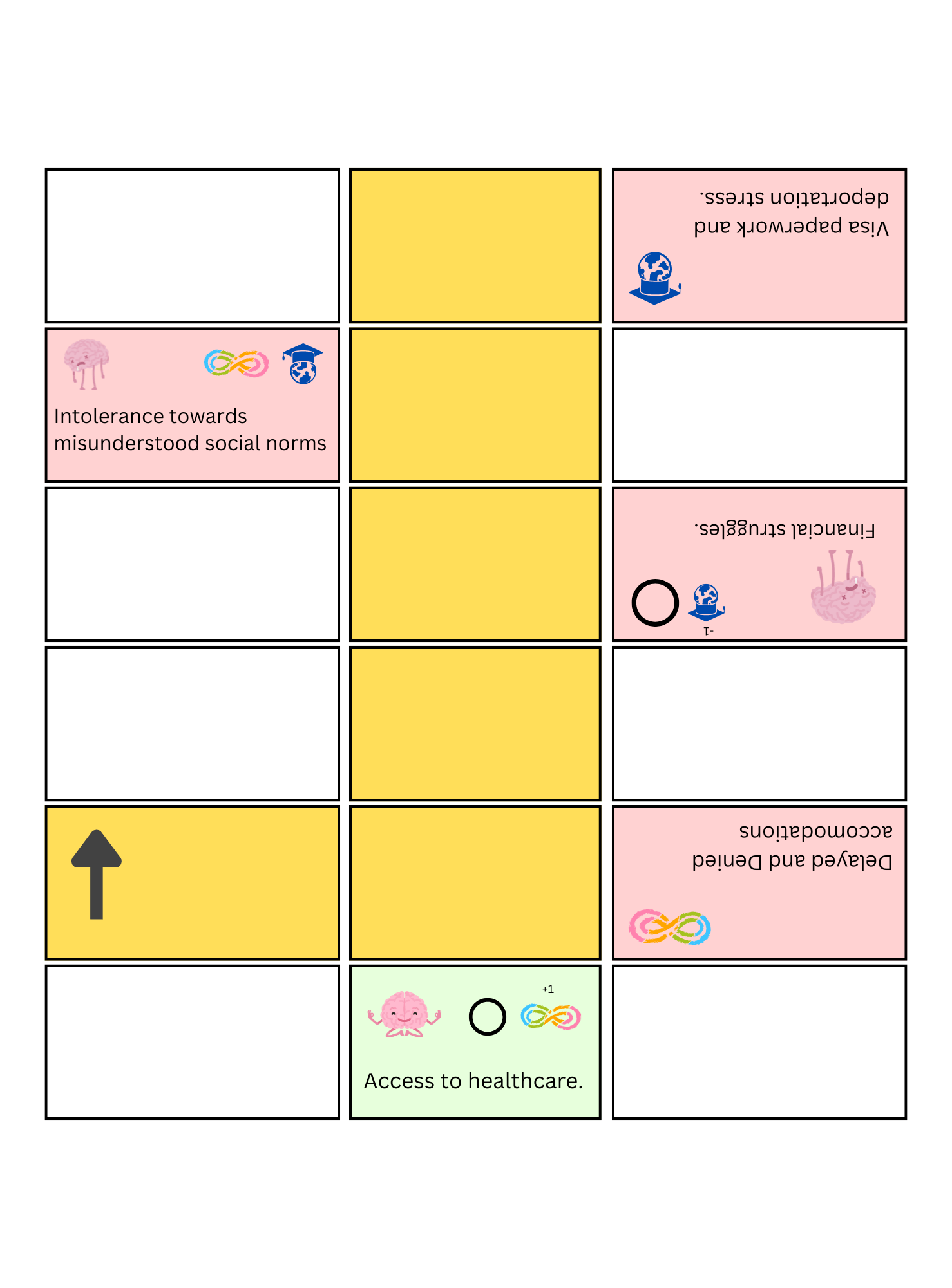
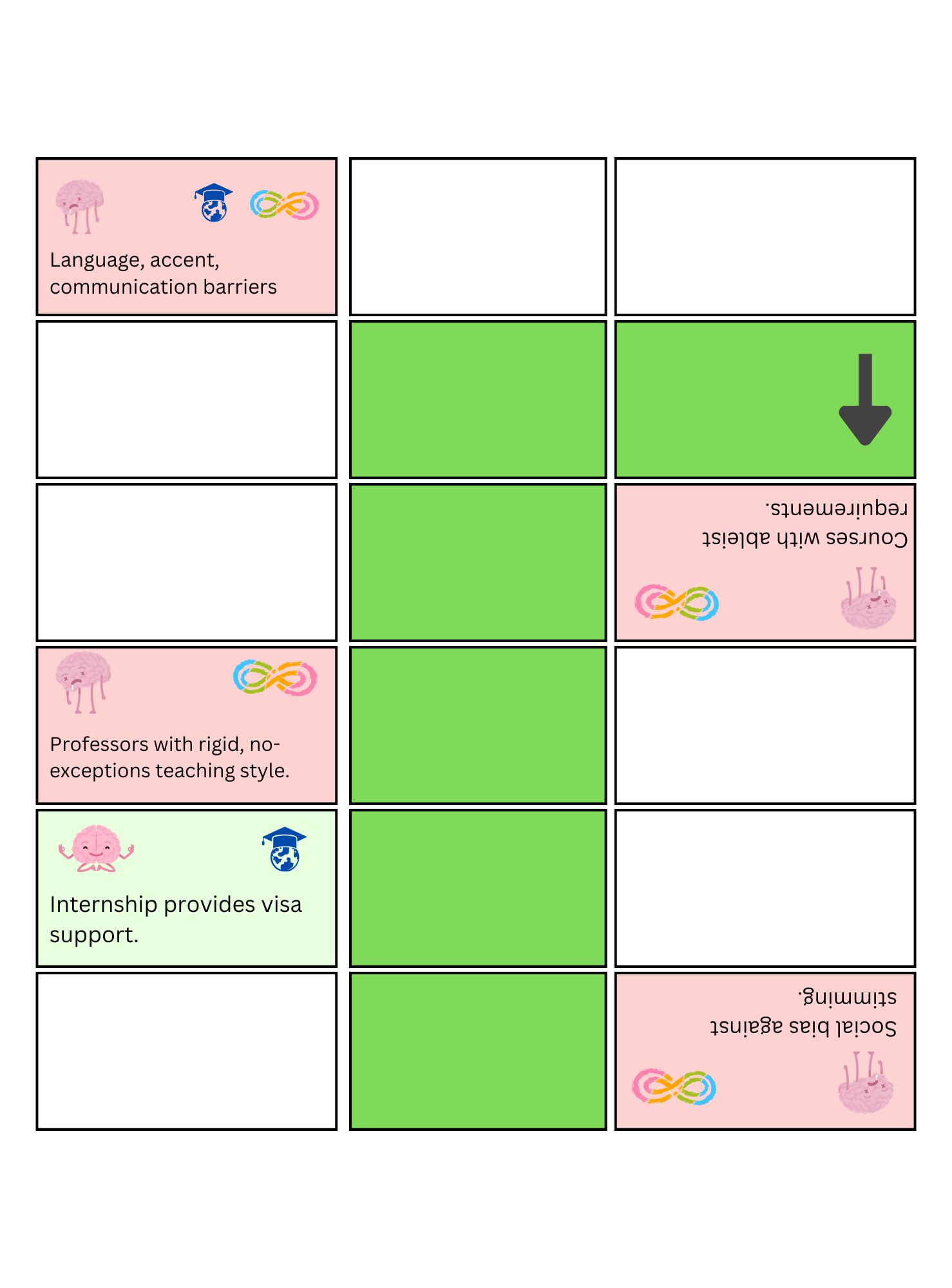
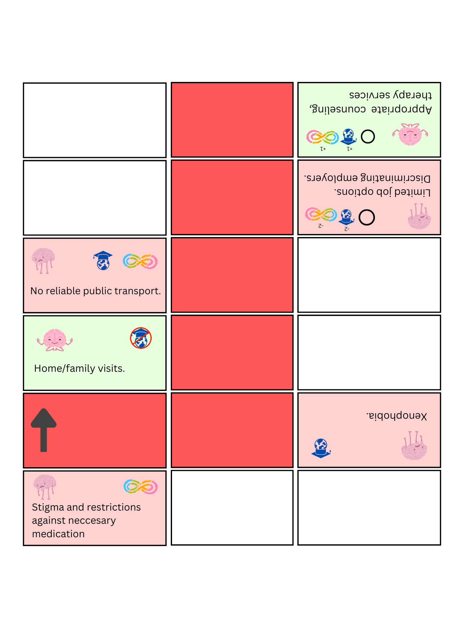
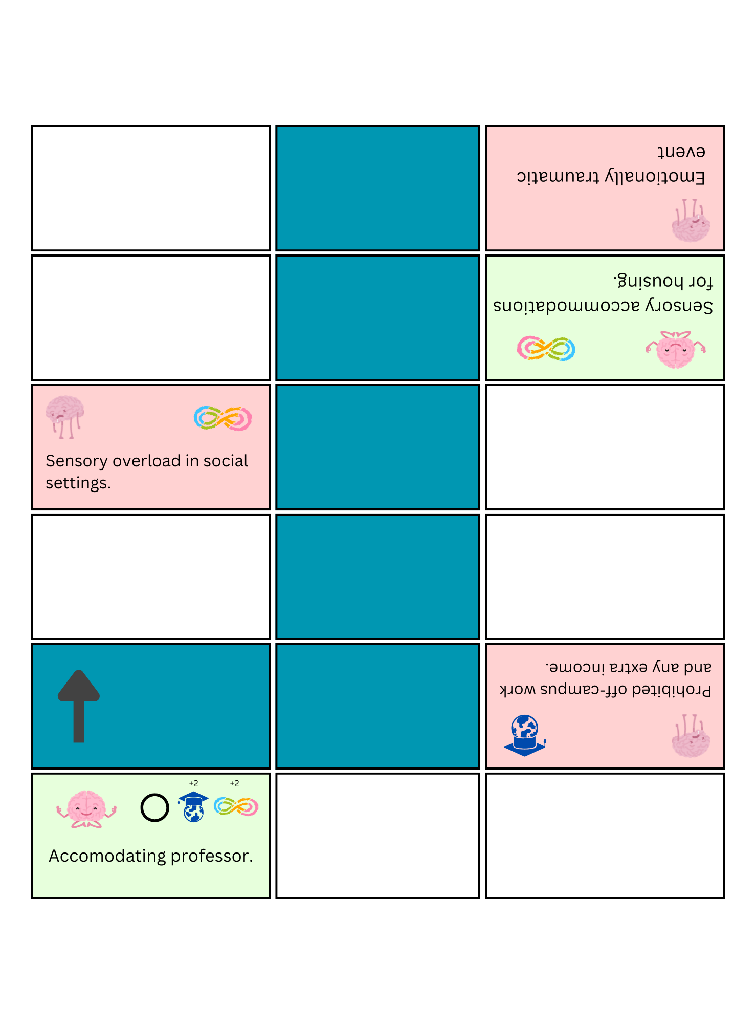
Ludo is a popular board game in South Asia and regions across the globe, originating from the Ancient Indian game Pachisi. In my hack, I reskinned the board to create Summa Cum Ludo, rewriting the narratives around the pieces to reflect a journey through college, and how it differs significantly for minority demographics like international or neurodivergent students.

In the original Ludo, 2-4 players, each represented by a different color, move their pieces along squares that set up a route around the board, aiming to be the first to finish their cycle and reach “home” in order to win. The movement of the pieces in each turn is determined solely by the roll of a die. In Summa Cum Ludo, the 4 players are college students, each headed towards graduation instead of a “home,” and the route of the pieces reflects their journey through four years of college. However, the pieces are distinguished not only by a color, but also by the demographic they belong to within the college student population. I chose a 2×2 player design to represent four possible demographics: American-Neurotypical, American-Neurodivergent, International-Neurotypical, and International-Neurodivergent, utilizing the affordance of Ludo’s red-green-blue-yellow player aesthetic. 

By distinguishing pieces in this way, Summa Cum Ludo enables a jarring shift in play. Dice are no longer the only alea element; where you were born and who you were born as are facts determined by chance long before the game started, but are now part of the play by directly influencing the trajectory and outcomes of the game. Such a shift allows us to meaningfully revisualize real-world structures, such as college, where each player appears to have a similar destination (graduation) and a similar path (taking courses, building a resume, applying for jobs, etc.) but is not actually in the same boat as other students. Not all squares in Summa Cum Ludo are blank, neutral steps. They are inscribed either with a cost or a benefit, which may affect only one, some, or all of the students depending on the demographic they’re in. The costs represent exhausting obstacles or disadvantages that influence students’ path towards graduation, such as financial struggles or emotionally traumatic events, and benefits represent events or experiences that support their journey, such as accommodating professors, therapy, etc. 

Under Roger Caillois’ frameworks of play, classic Ludo is a combination of alea, agon and ludus. The dice are the main determinants of outcome, and the game is played primarily for fun. Summa Cum Ludo, however, transitions into the realm of mimicry in multiple ways. First, to have your pieces belong to a particular demographic of college students as you move on the board invites the players’ imagination into the same role. Since the squares directly reference player demographics when imposing cost or benefit, the player must come to see themself as part of that demographic in order to successfully navigate the board. In addition, the player must be conscious of the roles of other pieces, their demographics, their privileges. 

In Ludo, the agon attitude is spurred by the rule that a player can “kill” another player’s progress by landing on the same square as them, forcing them to restart the piece’s journey. Players derive their enjoyment from hurting each other’s progress, even though the ability to do so is primarily determined by the die rolls. In Summa Cum Ludo, there is no such rule. If a student lands on the same square as another, the only harm done to either comes from the square itself, and whether their demographic is vulnerable to that obstacle. The players’ energy counter (i.e. a health bar) is what keeps track of such harm during the game, and once the energy runs out, the student cannot continue anymore. This choice more closely reflects the dynamics of students in college, without removing the possibility of harm in the gameplay. Such a form of mimicry also sparks what Miguel Sicart calls cognitive friction. If students are moving towards graduation, overcoming not the collisions with each other but rather the obstacles determined by life, then what is the meaning of reaching graduation first? Is play thrilling when you beat other students who were faced with greater disadvantages? Should the winner be proud because they reached the destination first, or because they reached the destination at all, in which case each student who reaches graduation has won. Are those who got burned out and never reached graduation considered losers? One extra rule turns this ethical dilemma into a wicked problem: if a player lands on another’s piece, they can choose to offer them energy by lowering their own. In doing so, a student may counter the unfairness of the system. Will any player help another, and if so, which demographic, and which not? Will they make decisions based on energy, identity, progress, or something else? Will they hold grudges for not being helped by another?  

Mimicry, in this case, has forced agon and alea into a confrontation, igniting the ethical consciousness of players and tempting them to use moral thinking to solve an undefined ethical problem, which is exactly what constitutes a wicked problem. Under this wickedness, Summa Cum Ludo becomes a form of ethical gameplay. As Sicart puts it, ethical gameplay is “the experience of a game by players who make choices that are based on morality considerations that are derived from their understanding of the game system.” Summa Cum Ludo offers exactly this experience. It shifts the player’s attention away from other players and towards the board itself, breaking the perceived neutrality of the original gameplay, where the board favored noone. The route is no longer uniform, even though it is composed of the same number of squares for each player. Instead, the board has four layers overlapped onto one route. If you are an American-Neurotypical student, the number of squares that exhaust your energy are far fewer than an International-Neurodivergent student’s, and your path to graduation is by all measures a different path entirely, and the destination (graduation) holds a different meaning for you, yet the bird’s eye view of the journey only sees 4 equal players on a single board. The players must question the meaning of the path, the structure of the system, and why they are competing at all.

Ultimately, the bird’s eye view of Ludo is that of administrators, faculty, policy makers who decide what education is, how it should be implemented, standardized, and regulated, and it sees little of the layered complexity of student journeys. Colleges and all systems that rely on college metrics like GPA, graduation timelines, etc., disregard the differences in effort required to reach graduation. The concept of “fairness to other students” is often cited as a justification for standard policies around courseload, class structure, deadlines, etc., as if each student is moving to the rhythm of the same dice rolling in present-time. The reality is more like Summa Cum Ludo. The rolls of dice that happened at birth (will you be neurodivergent, will you need to leave your country to seek better higher education?, etc.) influence the outcome far more than single events along the way, and make graduation a non-generalizable, unique event for each student, that cannot be compared across groups of students to make judgments about individual ability, worth, and character. Summa Cum Ludo’s ethical gameplay directly questions the assumed fairness of such structures.

Design – using Canva

Construction