Colors and Moods, More participation = More Confidence?

As this was my first time being an observer of the group, I was unsure as to what I would need to record. One of my primary observations was the color of shirts/ jackets/ upper body clothing that people wore to class on both days. The dominating colors for Tuesday were:

  • Black = 7 people
  • Grey= 6 people
  • Blue = 4 people
  • The rest were scattered.

The dominating colors for Thursday were:

  • Black= 5
  • Grey= 3
  • Rest of colors were scattered.

It is interesting to see that the number of dark colors decreased from one day to another, although one could say that this was due to the weather. I would like to propose the idea that perhaps this change occurred because the Thursday class was much closer to friday and the weekend. Subconsciously people may associate the days after Monday with darker colors/moods and latter days with more color and life. While this may be a trivial observation with a more-trivial analysis, it is interesting to see the change.

Another observation made was the participation of the class with the new “everyone raise your hands” policy implemented. This technique was invented so there would be more class discussion without the awkward silence in between Dr. Sample’s questions. Out of everyone who raised their hands, only 19 people form the entire class talked in Tuesday’s class. After the policy had been implemented and the fishbowl constructed, there was a rise in participation. For each question asked there an average rotation of 3 people in the seats, along with 5 people in the fishbowl being the highest number at any given time. This was more participation than had been seen before, but there were few questions asked by the students themselves. On Thursday’s class, there was more active questioning on behalf of the class. While talking about fit bits, mostly the entire class was engaged in the video chat, and more questions were asked than was the norm seen in Tuesday’s class. Firstly, 5 people asked questions about the functionality, durability, and overall advantage if the device, indicating that they were highly interested in the subject. Even more people were researching the fit bits on laptops, as every table had every person on a laptop with the exception of 1. One can potentially draw the conclusion that since the installment of the new “hands up” policy more people have gained confidence in speaking their minds and becoming involved, since everyone has a chance of being call upon.

Logging In-Class Laughter

While I collected data on some of the standard measures that have already been reported, I would like to use this Observations post to bring to attention the amount of laughter that occurred in class this week. On both Tuesday and Thursday, I counted 7 instances of laughter. The criteria that I used to determine a “laugh” was simply that more than one person in class had to snicker, chuckle, giggle or smirk at a particular event. While this may not be the best way to gauge exactly how funny various things were, I felt that but making it necessary for more than one person to be laughing at once, it would eliminate the potential that one person simply found something funny based on an inside joke or personal experience that related to whatever was happening in class.

Tuesday, February 10:

  • Instance 1: A majority of the class laughed when Dr. Sample proposed that everyone raise their hand when he asked a question
  • Instances 2, 3, and 4: The entire classes laughed during the first round of questions when those called on by Dr. Sample passed the question on to one another
  • Instance 5: Many laughed when Mr. Sample mentioned that were would be trying something out another exercise (referring to the Fish Bowl exercise)
  • Instance 6: Several people laughed during the Fish Bowl experiment when the first person “tapped in” to the conversation in the middle of the room and relieved someone of their duties
  • Instance 7: A general chuckle occurred when someone pointed out that the undecided group, positioned in the middle of the room, did not initially have a seat to represent their opinion at the middle table
    • “No taxation without representation” murmured someone in the class

Thursday, February 12:

  • Instance 1: A few students laughed at the beginning of the Skype call with the r65 Lab workers as the group waved and said hello
  • Instance 2: A couple of students laughed when the audio on the Skype call cut out for a few seconds and Mark Williams mentioned that he, “Didn’t quite get all of that,” referring to a statement made by Dr. Sample
  • Instance 3: A few in the class laughed as Alex of r65 labs received a text and cleared it immediately while his phone was on screen-sharing mode
  • Instance 4: Many in the class chuckled when Alex turned off screen-sharing from his laptop, realizing that we were looking at ourselves through his Skype feed
  • Instances 5 and 6: Many groups at tables laughed when the Misfit bands were passed around
    • Specifically, one group snickered as Dr. Sample suggested the reason we are allowed to keep the bands is because r65 Labs doesn’t want them back after they’ve been on our dirty wrists for 10 weeks
    • The group I was sitting with laughed when we were deciding whether to wear the Misfit in addition to, or in place of a watch
      • One noted, “This thing does everything besides telling the time”
  • Instance 7: People laughed at my table when we read aloud the questions others had written about their data sets

Observations of 2/10 and 2/12

I was not really sure what I was going to observe at first, so I put a list together of some of the observations that I made during class. A lot of it ended up having to do with what the class was wearing on Tuesday and Thursday and whether or not the weather becoming colder than it had been would make any difference in what people were wearing. Overall I noticed that the numbers were pretty close to each other over the two days.

February 10, 2015

  • People in class: 28
  • Drinks: 9
  • Sweat shirts/Jackets on in class: 10
  • Collared shirts: 8
  • Long Sleeves: 27
  • Short Sleeves: 2
  • Glasses: 5
  • Hats: 0
  • Nike shoes: 7
  • Laptops: 14
  • Things Written on board: 1
  • Khakis: 7
  • Sweatpants: 5
  • Shorts: 1
  • Jeans: 12
  • Leggings: 3
  • Davidson Apparel: 5

February 12, 2015

  • People in class: 28
  • Drinks: 11
  • Sweat shirts/Jackets on in class: 13
  • Collared shirts: 8
  • Long Sleeves: 28
  • Short Sleeves: 0
  • Glasses: 6
  • Hats: 4
  • Nike shoes: 6
  • Laptops: 15
  • Things Written on board: 0
  • Khakis: 9
  • Sweatpants: 8
  • Shorts: 0
  • Jeans: 8
  • Leggings: 3
  • Davidson Apparel: 3


Prevalence of Sickness in Class

It’s that time of year…

On Tuesday and Thursday of this week, I decided to observe some of the patterns of sickness that seem to be sweeping the campus this time of year. Over the length of each class (and the few minutes I was in the room before and after class), I recorded how many times I heard someone in the class:

  • Cough
  • Sneeze
  • Sniffle
  • Clear his/her throat
  • Say the word “flu”
  • Say the word “cold”
  • Say the word “sick”

From the data below, we can see a few trends. One obvious trend is that the all “sickness-related actions” seem to decrease on Thursday. However, some of this data could be skewed, because of the fishbowl discussion. I did spend some time in the fishbowl, and I was not able to track these behaviors as closely as I hoped during that time. Even so, it seemed to me that the prevalence of “sickness-related actions” did indeed decrease during Thursday’s class.

Tuesday, Feb. 10th   Thursday, Feb. 12th
Action Occurrences   Action Occurrences
Cough 26 Cough 14
Sneeze 2 Sneeze 2
Sniffle 23 Sniffle 12
Clear throat 24 Clear throat 11
“Flu” 1 “Flu” 0
“Sick” 2 “Sick” 1
“Cold” 1 “Cold” 1

Observing Our Attention Spans Throughout Class

On Tuesday and Thursday, I observed the tendencies of our classmates. I wanted to see how our posture and attention shifted throughout class. There were three observable categories: number of hands on faces, number of phones on tables, and number of students looking at laptops. The frequency of each of the categories was calculated in 15 minute intervals both Tuesday (2/11) and Thursday (2/13).

I predicted that people would get more tired (more hands touching faces) and people would lose attention (stare at their computers and phones) as class ensued. Those trends can be seen in some sections, but the trend is not perfectly linear.

Also, I would like to note that some of the statistics might have been skewed because of our “fishbowl” session on Tuesday.Graph 1

Graph 2Graph 3

Graph 4


The Unseen Slaves of History

The series of letters discussed in Klein’s “The Image of Absence” are beneficial to understanding how the style of communication used back then would affect the work of modern day researchers looking over the letters. The age in which Jefferson, Evans, and Hemings lived was not one in which it was easy to communicate easily between far-flung acquaintances. Therefore, the letters sent back and forth between Jefferson and Evans reveal the many issues that this form of communication cause for historians hoping to glean some information from these letters. For example, the very first correspondence between Evans and Jefferson never actually mentions the name of James Hemings, nevertheless his image is still brought up as Jefferson’s “former employee” and he cannot be overlooked since the letter revolves around Jefferson’s desire for James’s return. How can we fairly examine James Heming’s responses and decisions regarding Jefferson’s request, when we never truly see his own writing? This is reinforced by Klein’s assertion later that “in a listing of search results, these letters do little more than reinscribe the absence of James Hemings in the Jefferson archive”. By showing that Hemings is totally absent from Jefferson’s archive of direct correspondence, Klein is able to highlight the lack of a voice for slaves and ex-slaves within the historical perspective. This is extremely important for understanding how historians must formulate theories on the opinions and life perspective of slaves. Any sort of writing must be taken with a grain of salt that it was most likely altered or edited by a white man after first created by a slave.


Reducing Context Cluelessness

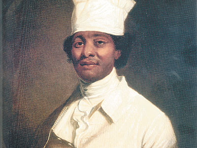
James Hemings’ identity was nearly lost as a result of archival silence

Typically, historians look to understand the happenings of the past exactly as they were. To understand the past, context is generally a high priority. In Lauren Klein’s paper regarding Thomas Jefferson’s letter collection, words and phrases were pieced together to form a new inscription about the identity of a previously unknown slave named James Hemings. Klein explained the recent discovery of Hemings’ identity as a result of “archival silence.” Because of gaps in archival record, Heming’s identity was lost deep in the annals of Jefferson’s literature. Without knowing the context and time period when Thomas Jefferson was writing his letters, the language can be confusing and misunderstood. It was taboo for someone of Jefferson’s position and status to write of slave laborers, so subtle hints had to be pieced together, much like a puzzle. Fortunately, through the use of text mapping, a new picture came to view, outside of the individual letters themselves.

One article from Technology Review revealed that text mapping can also explain changes in terminology used across time periods. The article made a point to state that terms can change meaning literally overnight. In an internet assessment run just after the release of the Microsoft operating system by researchers at Stoney Brook University, the term “windows” morphed into much more than just a common household feature. Technology changed the entire understanding of the word. Similar to the textplot software in Quantifying Kissinger, Google Trends and other similar features can offer a unique representation moments in history. Paired with the benefits of reducing “archival silence,” the use of text mapping software can help provide comprehensive historical pictures through inscription and representation that could be the future of historical archiving.


Reading Between the Lines…of Data

Lauren F. Klein, in her analysis of Thomas Jefferson and his data-storing tactics, The Image of Absence, comments on multiple ideas regarding the collection and interpretation of data. The most prominent idea featured in Klein’s work is the idea of “archival silence,” an idea that can simply be defined as “gaps in an archival record.” Though Jefferson was meticulous in his record-keeping, he would also reduce mounds of data regarding his slaves into small bits. Klein uses a particular slave of Jefferson, James Hemings, as an example, saying “Jefferson himself was at times required to recognize, if not to redress, the flawed logic that reduced Hemings’s life to a line of data.” Klein views this particular lack of record-keeping by Jefferson as an unfortunate sign of the times, showing that Jefferson played a large role in the silencing and subjugation of African-American slaves.

At the same time, Klein presents the reader with ways to combat the problem of “archival silence,” saying the reader ought to “look to the pathways of connection between persons and among groups.” Klein then presents a graphic showing the patterns of correspondence between Jefferson and others, concerning James Hemings. This graphic is not unlike those presented by Micki Kaufmen and the “Quantifying Kissinger” Team. Both graphics attempt to piece together information that is not explicitly presented in the data collected and attempt to display patterns, or “presences” (as described by Stephen Best and Sharon Marcus), hidden within the data collected.

It is this uncovering of “archival silence” that seems to scare so many individuals today. Many Americans will not soon forget the Edward Snowden scandal, nor the subsequent report that showed the US government was in possession of millions of Americans’ phone records. Why did this scare so many people? Was it because people were afraid that the US Government knew who we were calling each and every day? The could be. But, maybe what is more important is what phone records don’t explicitly show. Maybe, by using Klein’s tactics to uncover archival silence, and by reading the patterns and “presences” within these phone calls, the US government can ascertain more information about the callers than is ever presented within the records themselves. Maybe what citizens have to fear most is not the uncovering of their data, but the patterns hidden behind that very data trail.

Using Jefferson’s Letters to Recreate Networks and Narratives

In her article “The Image of Absence,” Lauren F. Klein advocates for the use of data visualizations in recreating historical narratives. Specifically, much of her paper is spent analyzing Thomas Jefferson’s letter collection as catalogued in “The Papers of Thomas Jefferson” digital database. Her primary subject is a man named James Hemings, a slave of Jefferson’s who eventually became a chef at his French estate. Throughout her article, Klein notes that while Jefferson’s letter collection is extensive, researchers are rather limited in the potential claims they can make regarding the Antebellum period due to Jefferson’s narrow point of view. Furthermore, Klein suggests that data visualization methods and specific searches within the collection can elicit more telling information of the time period.

Klein notes that one of the main issues with any written work of this time revolves around the fact that they were published by white, landowning males. Therefore, even works written by slaves don’t yield an accurate portrayal of the networks and social structures that truly existed during Jefferson’s lifetime. Klein urges that in order to reconstruct these narratives, “We must look to the pathways of connection between persons and among groups, the networks of communication in which these men and women engaged, and the distributed impact of the labor they performed” (665). Here, Klein asserts, is where data visualizations can fill the gaps that individual letters and correspondences create. Perhaps the most interesting example of the role of data visualizations in her article, Figure 3 depicts the “networks of relations” embedded in a specific set of letters pertaining to James Hemings’ life. The figure, pictured below, was created by a computing process that identified groupings of words that resemble people’s names in 58 letters referencing Hemings. Klein concludes that figure exhibits the intricate relationships that existed between all members of Jefferson’s network, including his family, political correspondents, friends, plantation staff and his slaves. Examining Hemings’ node on the figure, it becomes clear that unlike the traditional narrative of the time, he was in correspondence with a variety of people, including Jefferson, Jefferson’s friends and even free plantation staff. Additionally, Klein notes that the significant amount of correspondence between Jefferson and the Hemings family suggests that he truly relied on his slaves and actively sought to communicate with them. The overall importance of the figure is to highlight the complex networks and interactions that are often difficult to see in such a one-sided historical narrative as the Antebellum period.


Visualization of the network of relations within the "Hemings  Papers." Width of arc indicates relative frequency of correspondence. Image by Klein
Visualization of the network of relations within the “Hemings Papers.” Width of arc indicates relative frequency of correspondence. Image by Klein

Digital Humanities and a New Definition of Knowing

PilesOfBooks

Klein proposes the viewpoint that digital humanities requires one to sit back and analyze the extent to which we are knowledgeable about certain information. A deeper analysis of Jefferson’s slave James Emmings whose true identity is no fully known leads her to issue a call to action for digital humanity practitioners to go out into the world and uncover the information that has yet to be found. She believes that no longer can we be satisfied with knowing, but now we must also ponder how we know things to be true, their origins.

While Klein does bring up a very good point, I believe that one must question the completeness of her claims. Why is now the time for digital humanities to theorize their claims? Yes we have more technology that can aid in deeper research of how we know information, but if this practice was as necessary as she deems it to be, would it not have begun earlier? We are able to find out trivial things, such as Hemmings being educated, but this does not do much to help mankind as a whole in the future.

I would agree to the statement that digital humanities will reveal much information, but I cannot help but wonder how that information will be put to use. If we as of now do not fully “know” certain subjects well, when will we get to that point as a collective society? Is it worth it to swim in unclear waters in search of how we know information if we do not know what fully “knowing” consists of? It seems somewhat pointless that Klein would state our inability to fully have understanding of a certain subject, without defining full understanding. Eventually a limit on how much we know will be set, but until that time, the concrete purpose and usefulness of digital humanities will remain incomplete.

Klein, Laura.”The Image of Absence: Archival Silence, Data Visualization, and James Hemings.” Duke University Press, 2013.Print